Sam Carmichael
Product design consultant

A design system & component library conceived and built during my time managing the REDTech design team
Problem statement
As the REDTech design team got into gear with our new process and research sprints, we realized that we had a lot of work across multiple upcoming product and feature launches, and we weren’t happy with the fundamental design of the original product, Stargate.

Because of a range of product priorities over the preceding years as well as a number of different code bases, Stargate was both visually inconsistent and also had clear UX flaws (legibility, usability of key components, basic information hierarchy) that at the time could only be fixed piecemeal. We didn’t want to build new products on such a flawed framework.
Solution
I organized an off-site for the design team to discuss the best way forward. At the time, in late 2017, Design Systems were really becoming a hot topic, and we decided that with some up-front work on our part we would put one together for REDTech based on the best UX that we’d seen, both internally and elsewhere at companies we admired.
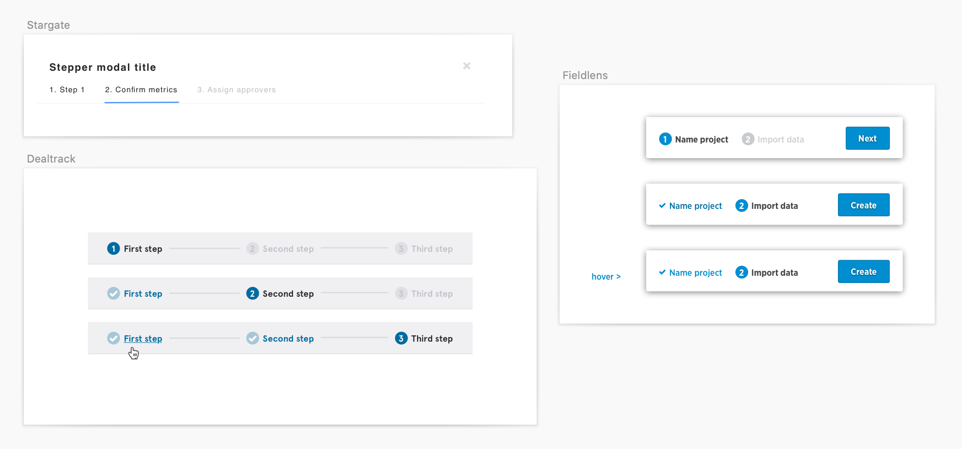
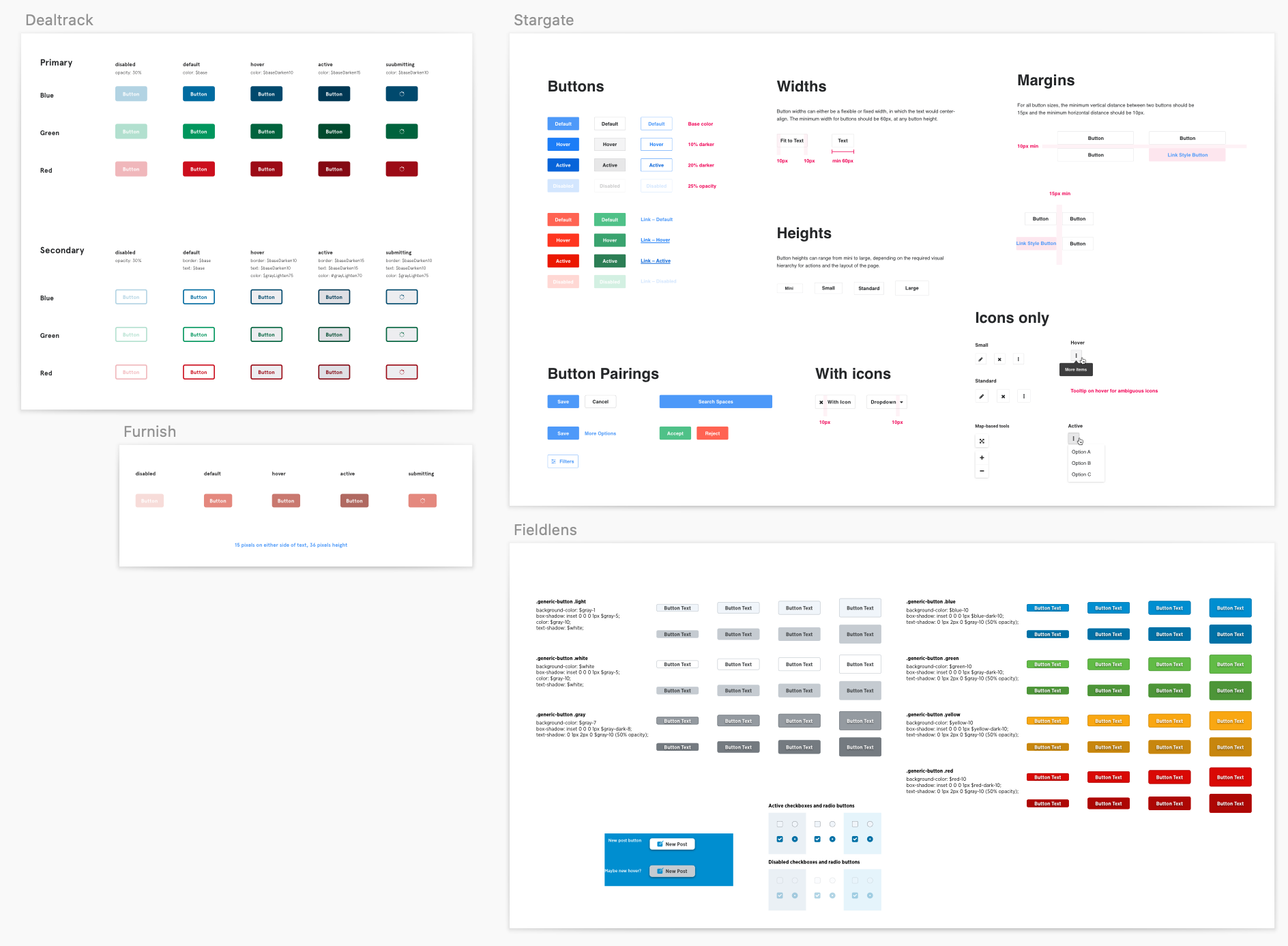
At the offsite, we conducted an audit of existing products/features as well as some emerging and improved components that had been designed for new features. We picked and chose the parts we liked best from what had come before, jettisoned the rest, and then collaboratively designed the most critical atomic components. This had multiple benefits: the team became better at working together, compromising, and learning from one another; the styles that we developed were internally consistent; and we all learned several new Sketch shortcuts to take back to our day-to-day design work.
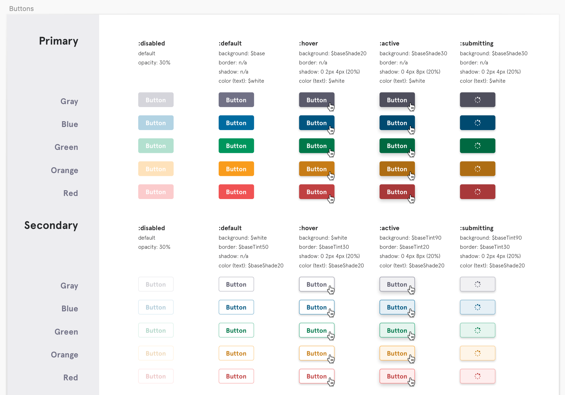
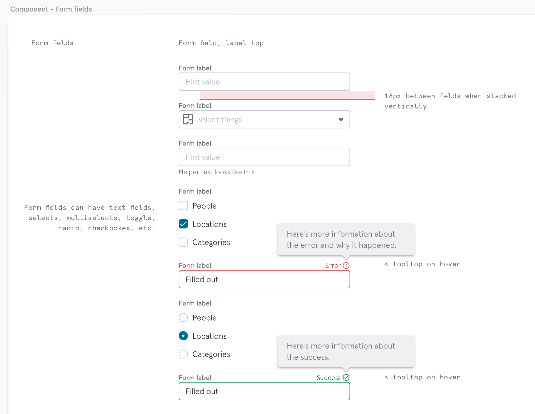
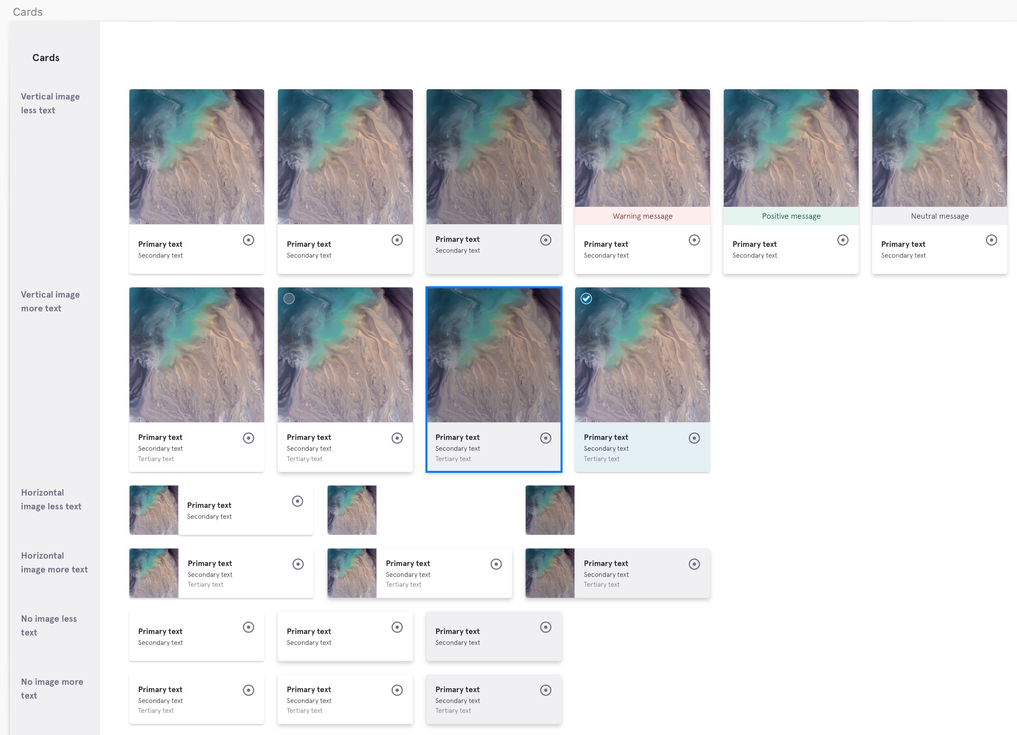
Once we had the atomic elements in good shape, we tested each for accessibility, mocked up a few key screens to “pressure test” them in situ, and then created a Sketch library to enable faster and more consistent design.
Concurrently, I presented the concept of a Design System to the Engineering leadership, along with another senior engineer who spoke to the value of a React component library. We were able to convey the benefits of a component library and design system (consistency, efficiency, etc) and got the blessing to develop a full component library for use going forward.
Learnings
Pebble was a big undertaking. It led to much stronger team morale and design chops, improved UX across our apps, and greater efficiency for our engineering teams. That said, we essentially undertook the work “on the side,” in addition to our day-to-day squad work. This caused the project to stretch on for more than a year, and it resulted in some engineering hiccups (key component work being paused for P0 tickets, etc). I’m glad that we got so much work done in an extracurricular setting, but in retrospect I wish that we’d pushed harder for a dedicated squad to manage and execute the work.
At the time there were a few other internal design teams working on their own component libraries; these were different because they were geared toward different use cases (our marketing sites) or built on different code bases for different users (such as outbound sales) but I wish that we’d been more communicative with these teams, earlier, in order to reduce duplicate work. In very recent months, these design teams have combined forces and now strive for consistent components throughout our internal systems.