Sam Carmichael
Product design consultant

A tool for user research curation and consumption, accessible to all of WeWork’s internal teams
Problem statement
When I joined WeWork, my boss Tomer Sharon had been spending his time getting to know how our Community, Technology, and Operations teams decided what to work on. He heard repeatedly that our colleagues felt pressured to make decisions based on executive priorities and pet projects (top-down), rather than using insights gleaned from the member experience (bottom-up). Healthy businesses should have a balance between the two, and it seemed WeWork’s approach was out of balance. We set out to fix it.
Solution
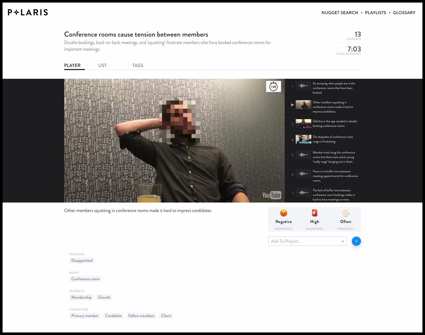
To inspire more member-focused decision-making, Tomer envisioned a solution called “Polaris,” a database that would allow for the capture, categorization, and consumption of insights on the member experience. These insights were built upon “nuggets,” or tiny atomic units gleaned from the hundreds of member interview videos the UX team completed over the course of a year or so. This system could work for many businesses, but it would be especially powerful at WeWork.
Tomer came up with Polaris; my team’s task was to build an interface to enable it.
For this project I worked with another product designer, a prototyper, and a researcher. First, we gathered requirements from future users of the tool, and brainstormed as a group. Then I captured competitive examples (the card-based interface from Vox explainers, YouTube’s playlists features, etc) and we started sketching.
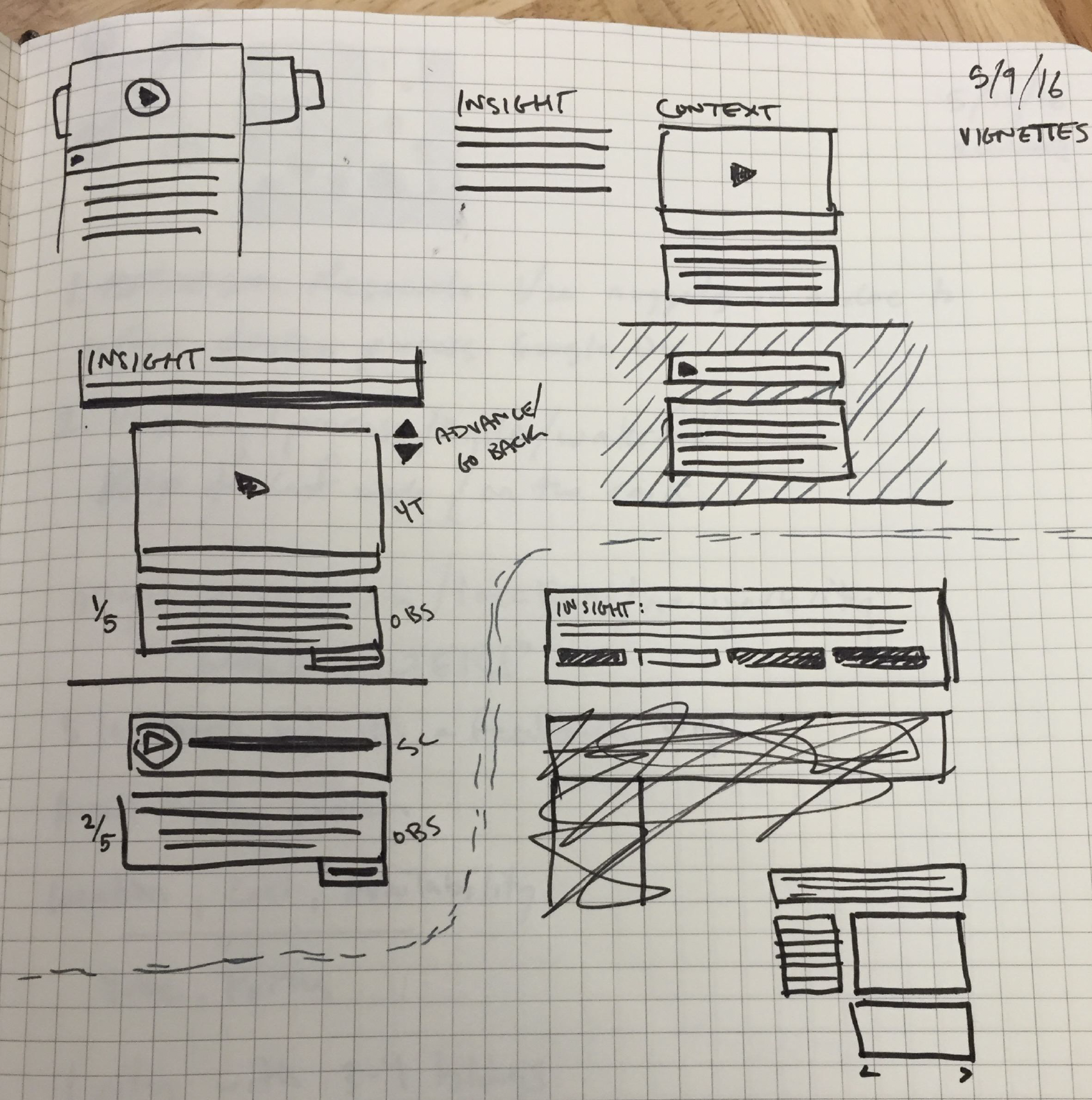
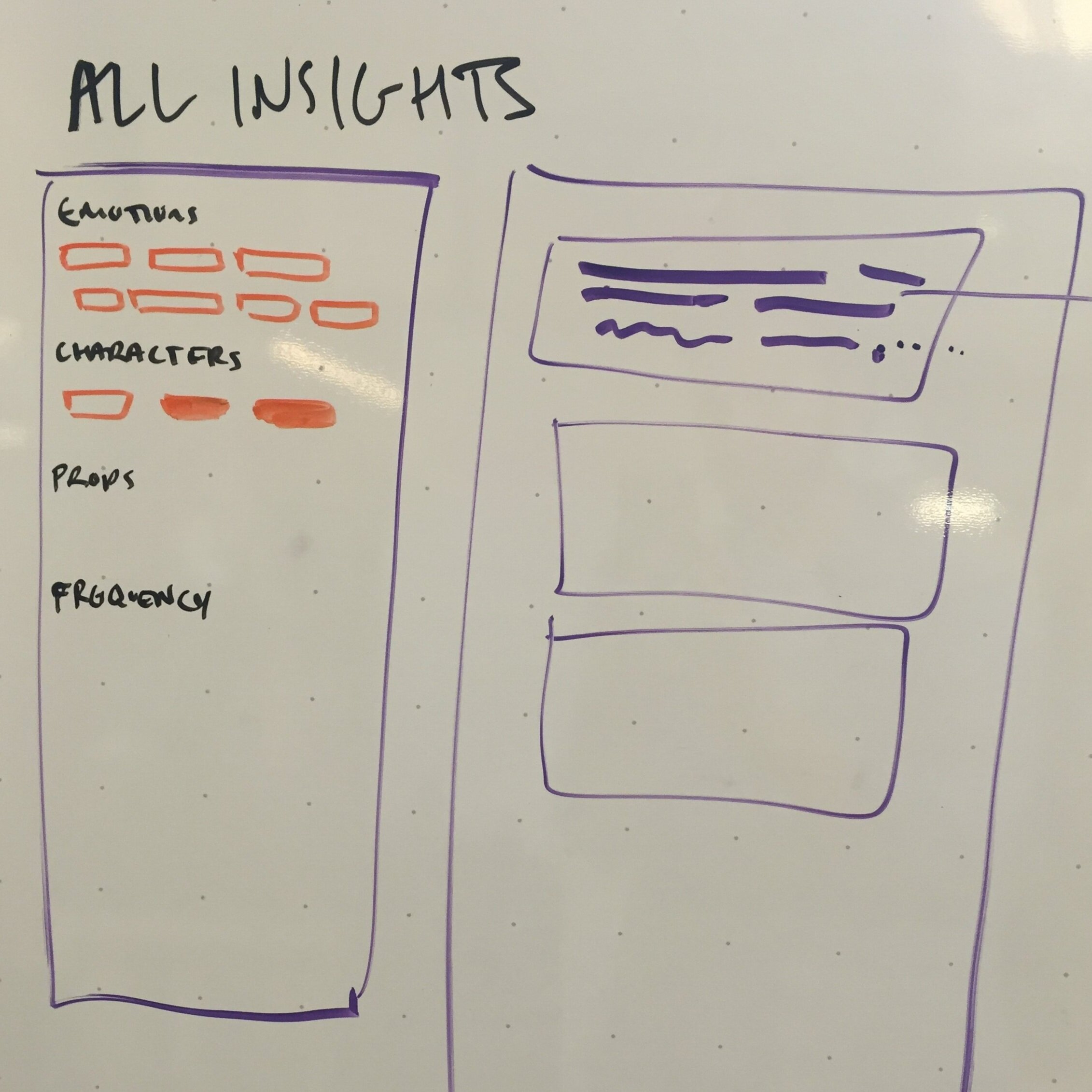
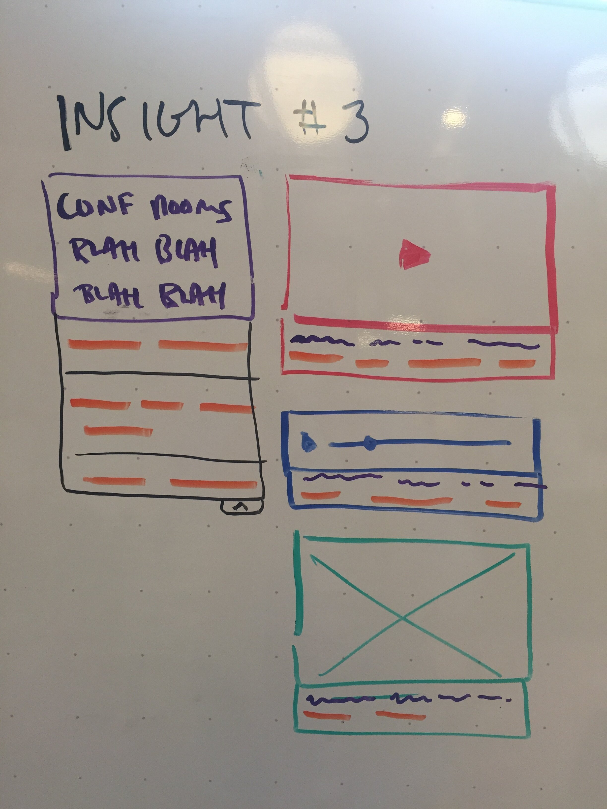
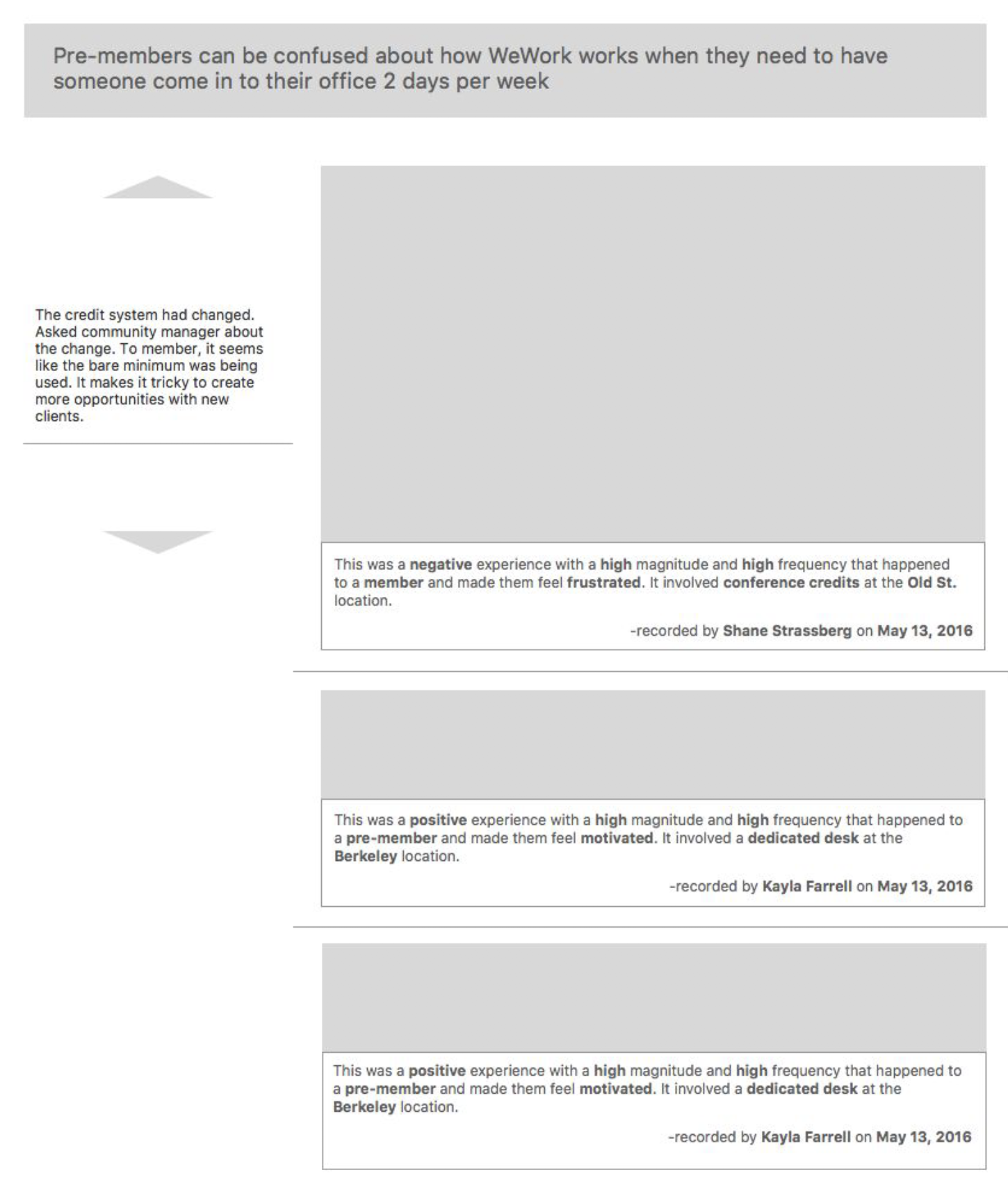
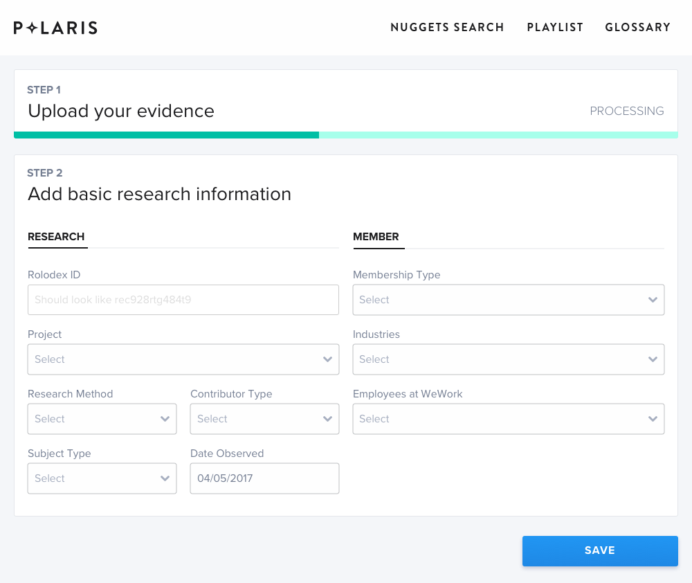
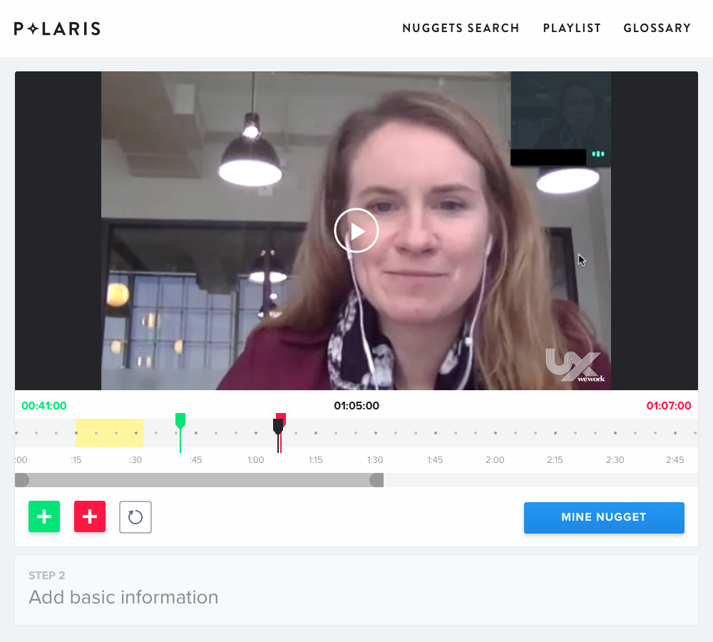
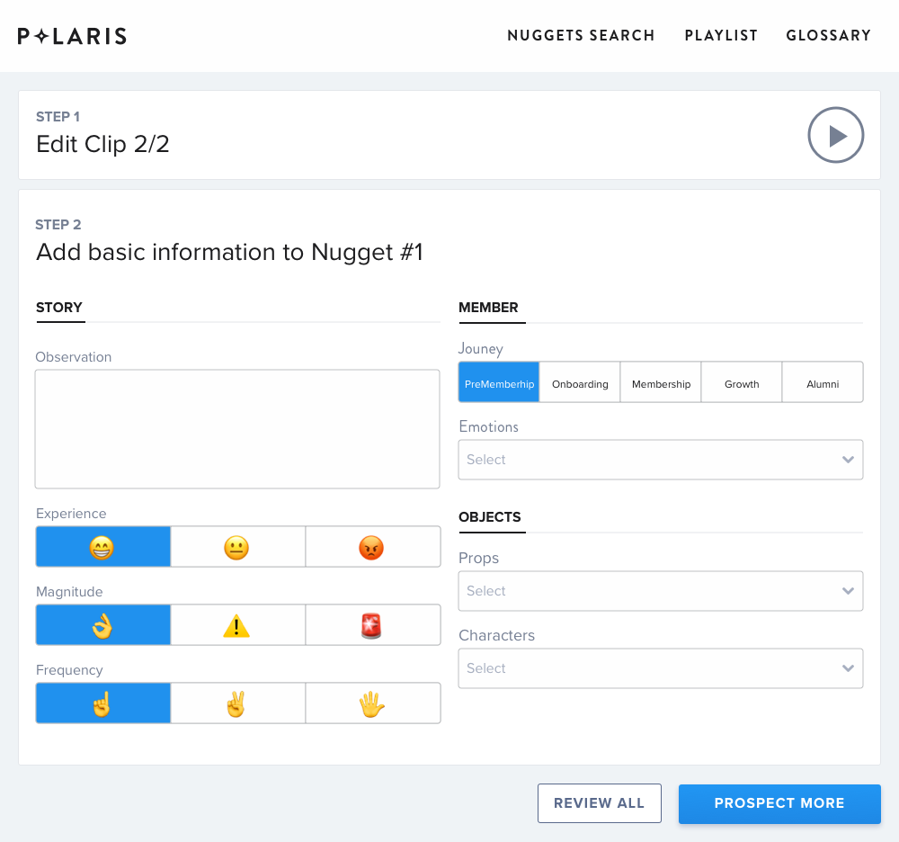
The product was a fun challenge because it required two very different user experiences; the “Creator” view, and the “Consumer” view. For the Creator view, we had to allow our research team to upload a video, add metadata, break the video apart into only the most relevant nuggets of information, categorize and describe each of these nuggets, and then publish the results.
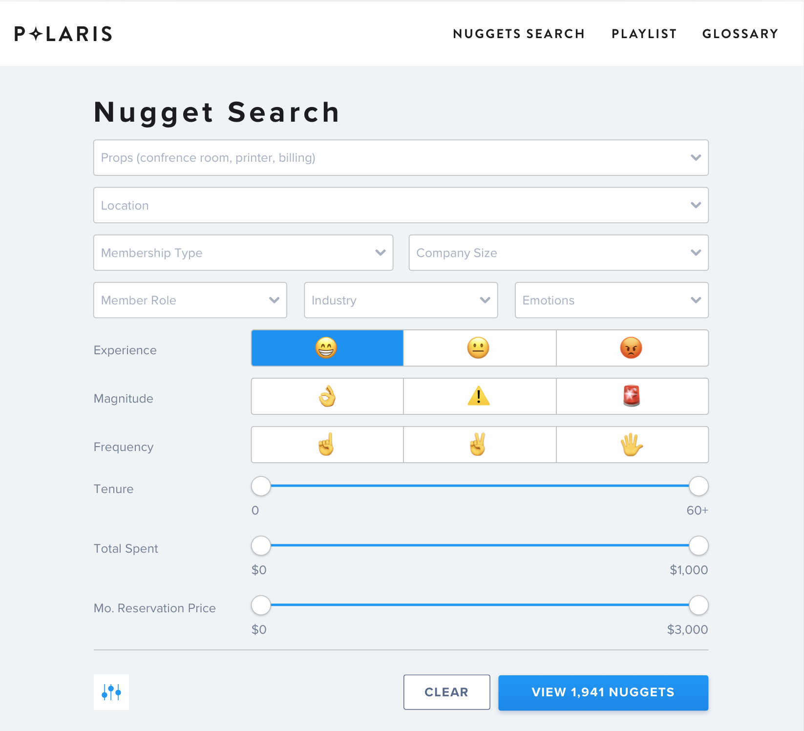
For Consumers, we had to allow for easy browsing and viewing of these nuggets, as well as the ability to organise them into “Insights” or playlists comprised of many nuggets.
As we iterated through multiple solutions, we had to begin accommodating more edge-cases; screenshots, PDFs, links out to Google docs. With each additional format we added in new functionality, and as the database and user base expanded our developer had to upgrade the underpinnings of the application. However, within six months we had successfully launched the product to the entire company, and people from every tier of the company were using it to identify and probe areas of opportunity within the member experience.
Learnings
Polaris was a trailblazing product that attracted positive attention in the greater design research community. However, it never really took off within the company and was shut down 2yrs after launch. In retrospect, I can see a few things that led to its downfall. First, Polaris was probably a tool better-suited to a company in a stage of more stable growth, rather than the exponential growth that WeWork was attaining at that point. There were so many priorities related to this expansion that optimization for existing members took a backseat. In addition, many of the “nuggets,” while compelling, had a relatively short shelf-life due to rapid changes in policies and staffing at our buildings, so the amount of effort it would have taken to continue adding up-to-date interviews to the library was quite high (but not insurmountable). Finally, I believe that while we worked hard to design a platform that was accessible and open to the entire company, we didn’t do enough of the up-front insight curation ourselves. If we’d taken a more hands-on approach to generating insights that teams could then begin working with, I think we would’ve gotten more users “hooked” on the product, which would’ve led to better user retention. I’m sure this is a common problem in any company that relies on user-generated content.